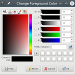
 The color selection dialog includes a number of different modes for color-selection.
Its features and functionality are standard but wide-ranging, so you can use what works best for you each time you pick a new color.
Dialog Activation
![]() The color selection dialog is easily opened at any time by way of the toolbar’s Foreground/Background (FG/BG) icons.
The color selection dialog is easily opened at any time by way of the toolbar’s Foreground/Background (FG/BG) icons.
Hovering over the boxes will tell you:
Foreground and background colors.
The black and white squares reset colors.
The arrows swap colors.
Click to open the color selection dialog.
Alternatively, there are a variety of methods that can be employed to add the color selection dialog (usually without all the features that the FG/BG dialog provides) to Gimp’s interface for even easier access.
1. You can keep the dialog box open and dock-able via the Windows > Dockable Dialogs > Colors menu.
2. You can add the dialog box as a tab to many existing dialogs by clicking on the tab icon (![]() ) and selecting Add Tab > Colors.
) and selecting Add Tab > Colors.
3. These tabs and dialog boxes can usually be dragged around to re-arrange them and/or toggle them between tabs and dialog boxes.
Color Selection Dialog
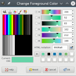
There are a number of things going on in the FG/BG color selection dialog.
On the left-hand side are a number of tabs that we’ll get to very shortly, along with the current and last-selected colors for comparison.
On the right-hand side are the scales selectors, where you can adjust H, S, V, R, G, and B (Hue, Saturation, Value, Red, Green, and Blue).
Below those, you can see (or type in/paste) an HTML color code, pick a color, and see/re-select the last 12 colors selected.
One point to note is that the color picker in the color selection dialog will pick a color from anywhere on your entire screen, rather than being limited to the confines of an image like the toolbox color picker is.
Also, try typing the names of colors (or even a single letter) into the HTML notation box to select that color (or see color suggestions).
Now let’s jump into the various tabs on the left-hand side of the dialog.
Color Selector
 The color selector tab is open by default when the color selection dialog is opened.
Simply click anywhere to select that color. Click on the vertical line on the right to change what color(s) you see.
It’s rather fun (and informative) to play around with the color selector and be able to adjust so many details.
CMYK
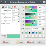 The printer icon opens the CMYK selector tab.
The CMYK selector has components for Cyan (C), Magenta (M), Yellow (Y), and Black (K), which are the modes used for printing.
Values can be adjusted so that the color relies more heavily on black ink during printing, rather than the (usually) smaller, more expensive CMY ink colors.
Triangle
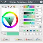 The triangle selector allows you to select colors based on the HSV model (standing for Hue, Saturation, and Value).
Click on the circle and/or drag along the circle until you have selected the hue you want, then click/drag inside the triangle to adjust the saturation and value.
Watercolor
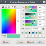 The watercolor selector introduces an interesting concept, in that instead of actually selecting a color, it adds some of the selected color into the color already selected.
The best example is to start with white, so that any color you click will be what you can see gradually over-powering the white in your currently selected color.
The selector is aptly named, if you’re familiar with watercolor-painting.
There is a vertical slider to the right of the watercolor selector that increases or decreases the rate of each click’s saturation.
Palette
 Not to be confused with the other! palette that Gimp provides in color tools, the color selection dialog palette only shows a list of colors in the current palette.
The other! palette is accessible as a dock-able dialog and provides 40 palettes to choose from, which, when selected, will show up as the current palette in the color selection dialog palette tab.
Conclusion
This lesson feels a little too basic, but is all a part of getting our feet wet.
More about color and color tools is coming up next!
